Blog Make Over Input Requested
I want to invite all of you to check out the new "beta" site at:
http://christopherdhall.com
It's not "live" yet, so I want your input, especially on the following:
1. Does it look good?
2. Is switching domains (again) too obnoxious?
3. Does it look professional, but not "cold"?
4. Do the fonts and colors look right?
5. Anything else I am missing...
Thanks for your help.
And I there is a reason for this rhyme. Same as it ever was. :)

11 comments :
Too busy for me. I don't like more than one sidebar. All those graphics up and down the sides, and adds, they confuse and distract me.
Is that the view from your pulpit? It's seriously nondescript.
Other than that, I don't think it's that bad. Just keep track of your 404s when you move the domain, and notify those people when your links change.
I agree with Bryce: too much stuff in the sidebars. I would get rid of the ads (unless you really need the money - and if you are getting more than a few cents for it), The True Alternative, Recent Comments, Tag Cloud, and the About Me on the home page when you have an About tab people can go to. Simpler Subscribe and Archive options would be preferred, too. I don't like the title above the photo - if it could be overlayed on the photo, that would likely counter Dan's nondescript comment.
I like your the Turkish image better. I like the pulpit image because it matches the title so well, but on the beta site it looks like it is a montage of three different photos knitted together - when you had the same image up on Blogger before I didn't notice such knitting.
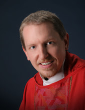
I tend to prefer more abstraction relative to blog authors. I don't like seeing photos of the blogger. An image that gives a sense of the person, the tone of the blog, etc. is more evocative to me. A photo of a person takes away the mystery and adds in all sorts of other thoughts relative to quality of the photo itself, choices regarding clothing and hair, lighting, etc. that clutter up one's impression of the writing and thoughts on the blog. In the end, a blog is a written medium even if it also allows a certain degree of visual flair (movies, images).
Good comments so far. I could have imagined the criticisms based on your own blogs ;). Christopher, you're right about the "About Me" and the "About" tab. I'll fix that. The Ubuntu graphic I'll probably move, or it'll be Time's Up by the time I make a move over there. The ads, well, they do help the bottom line, not much, but they do.
The title and photo I've spent a lot of time thinking about. I may try to combine the two, though my graphics skillz are weak.
Thanks for the critiques so far. Keep them coming, folks!
Btw...no link to my blog, This Side of Lost or to Lutheran Theology: An Online Journal, is a major drawback for me. :)
I was going to say that I thought it was just fine, but the password below is "Flatious" - which. . . if you do Latin. . . guess my comments were predestined to be so much blowing of wind.
There are as many opinions as there are people which accounts for the hundreds of different blog options and templates available. A blog is a personal expression so feel free to do what you like...however, I agree with Christopher regarding the photo image of "This Side of the Pulpit". It looks as if you suffer from myopia...and I like the Turkish prison better, too.
Where I disagree is with the inclusion of the photo. I like seeing photos of real people. It helps me keep in the forefront the person behind the blog. Besides...you are better lookin' in real life than your Simpson counterpart let on. (All that said you'll notice I don't have a photo on my blog site. I am vain and I am old and I am gray and lots of other reasons but mostly because I don't look like Kim Basinger. Besides I'd rather not restrict dialogue because I remind someone of their mother!)
Of course, my ultimate opinion is that you don't have enough RED on your website. Everything is better with RED! :D
I think it interesting that an Anglican and an Orthodox are the ones arguing for more restraint in images and for more of the bare word.
Good point. You and Fr. Wandrey are now exposed as un-converted, crypto-Protestant iconoclasts. ;)
I just like to keep things simple; except for my liturgy.
Post a Comment